This is the final project for my Modern Illustration Class. We need to create a logo & poster for Mohawk Communities Builders. The logo should have visual element. And for the poster, I am thinking about use the logo as the main picture, with typography elements around.
And here are my concepts:
First concept is the picture of 2 people are making a house together:
Next concept, I used Mohawk College logo as a frame, with the picture of a house "under construction" inside:
The last one I used the Mohawk College logo again, but with the picture of the people working around:
Monday, March 28, 2011
Wednesday, March 16, 2011
IF - Warning
Here is my design for Illustration Friday - Warning.
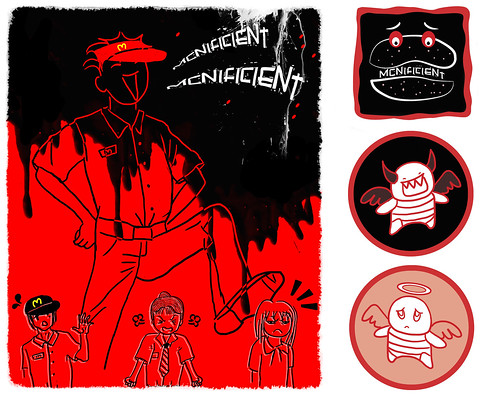
These are actually my 2 separate designs for Screen Printing class:
When I saw Illustration Friday's topic is "Warning", I was immediately thinking that putting those 2 images together would be really fun. And here my final image:

These are actually my 2 separate designs for Screen Printing class:
When I saw Illustration Friday's topic is "Warning", I was immediately thinking that putting those 2 images together would be really fun. And here my final image:

IF - Layers
Here is my new picture for Illustration Friday "Layers".
My concept this time is about people: How many layers we actually put on our face everyday? They're not only the beautiful makeup on woman face, but also the emotional layers somebody put on to hide the real person inside them.
So I come up with a picture of a sad girl wearing a smiling mask. This is my linear:
And my color comprehensive
The color is kinda washed out, so I bring it to photoshop to make the picture more vibrant. I adjust the level of color in Photoshop, then use Filter "Ink Outline". Here is my final design:

Monday, March 14, 2011
What happened on that wall??
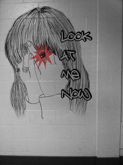
This is the project I did for my Modern Illustration class. My teacher got inspired from Banksy's artworks & he wanted us to do something similar like that.
Concept: "Look at me now"
That's the title of Chris Brown's new song. But I actually was inspired by a small that my high school teacher had told me "Behind every stranger is a story that we can get a lesson from there". Everybody needs to be seen & need to be heard, even a very simple thing can mean a lot to them.
Process:
I asked my friend Dui to help me take a picture of her:
Then I took the picture in the hallway of school & start to work on that
My camera didn't work so well, so I had to change the color a bit in photoshop. After 3 hours in class, this is my final image:

Subscribe to:
Comments (Atom)


